
This is the Star Burger website concept I designed during my Cert 4 Web Development course at TAFE.
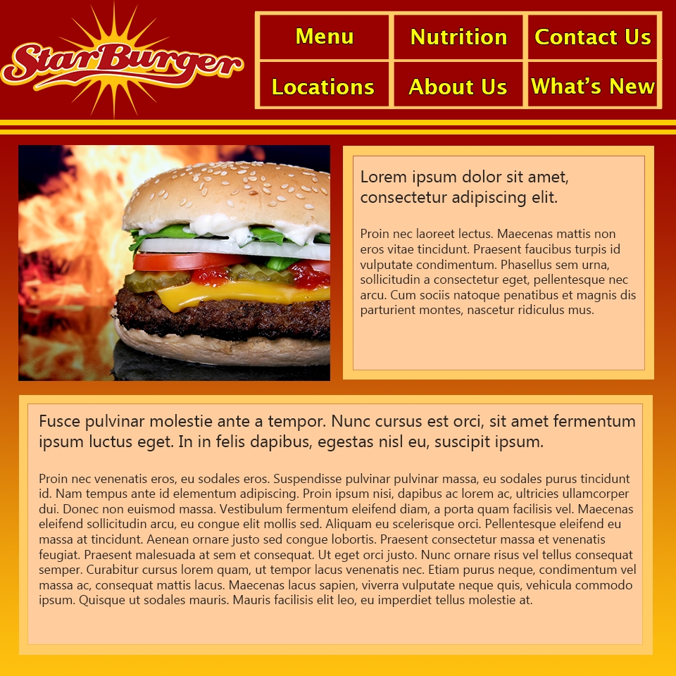
It is the very first concept I designed after coming to the realisation that vertical menu's consume too much screen space, and that light on dark is not always best.
I thusly chose to implement a more horizontally focussed menu (in a grid to better utilise the space) as well as a brighter overall theme to promote a sense of energy and happiness. The use of red and yellow derived entirely from the Star Burger Logo, helps promote positive emotions, but made it difficult to segregate background from content. I was only able to do so by utilising a mixture of both to create the content borders, and ended up using a different (albeit similar) colour for the content's background.
I am quite fond of the grid menu as a means of sharing space between the navigation and the logo, as well as the clear delineation created between the header and the content. The actual content, however, I feel I could have done better.